
Visual design – finally a topic we can all disagree about…
Most Power BI users aren’t competing for likes on Dribbble when building out Power BI reports. They want a design that’s simple, maintainable, and useful to the report consumers. Below are a few tips on the basics.
Visual Design Is The Last Step
There are quite a few prerequisites for a finished design in Power BI. Data models need prepared, calculations written, data validated, meetings scheduled to argue about the calculations with colleagues, apology letters written, group therapy and reconciliation, the BI Project gets a punny name like “PowerACME”, you are appointed leader of the project which by the way you told them at the beginning you should be, and finally it’s time to work through the visual design.

When initially exploring the data, I quickly build Table and Matrix visuals for data validation. After that, I layer on some of the basic filters I plan to use, and check I can slice and dice my BI Dimensions. I publish the initial “beta” model to PowerBI.com, then I focus on building end user experience in a separate Power BI file pointed at the Power BI Service. I’ll explain in an upcoming post about separating the data model .pbix file from the visual design .pbix file; the short answer is “do it”.
Building a fancy design to early forces iterating through many painstaking revisions. In Power BI, design is heavily influenced by the accuracy and completeness of the underlying data and calculations. Data is often wrong or incomplete in source systems and some early Power BI Reports may focus more on data cleansing than analytics.
Waiting until later in the development cycle to do pixel perfect design speeds up the overall process.
Reserve Color For Data Visuals and Buttons
Recently I’ve been looking at the Washington State COVID-19 Power BI dashboard. Clearly this is done by a skilled designer; I would not aim for this level of design for a “Hello World” attempt. However, it provides instructive points for any skill level.
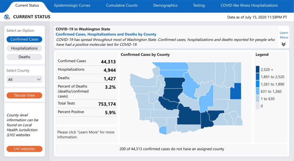
Notice that most of the backgrounds, text, and UI elements are either grey, white, or black. Those colors keep the eyes focused on the data – the important part of the report. The map visual has the most color; the eyes are drawn to the map first, then naturally move to the surrounding report elements.
The colors on the report are consistent in the same blue family, with dark/light representing different ranges. Limited color families look easier on the eyes; more importantly, for color-blind accessibility reasons colors alone should not represent a data range. For example, if this map used red for “bad” and yellow for “ok”, many report consumers would not understand the image.
Keep Tabs Simple
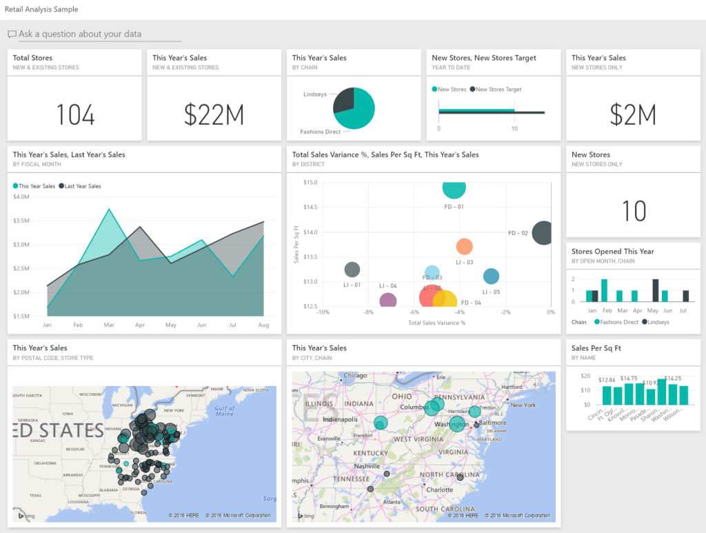
When Power BI is sold, and when you start Googling for report examples, everyone is showing off some clearly non-Production dashboard with 42 different things going on. A common beginner mistake (that I definitely made) is designing report tabs with too many elements and types of visuals.
Dashboards are great, but it’s unrealistic to expect this is where the design process starts. Generally, the first step is to build simpler report tabs around a single theme. After the simpler reports get some user adoption and feedback, then data can then be rolled up into higher level dashboards. The Washington State example illustrates this point – focused tabs that combine a couple slicers, a few data points, and a simple visual.
Design Quick Hitters
Some specific things that I add in my designs:
- Power BI by default uses a not-quite-black font that drives me crazy as it’s not-quite-as-easy-to-read. I change all the font styles to black.
- The default font sizes are too small.
- Limit “fixed” elements on the page – for example, extra background images or lots of extra text boxes. Unless the report will have hundreds or thousands of users, it isn’t necessary and makes it harder to update the design as users provide feedback.
- Load the same Report Theme JSON file into all the .pbix files. If the report is already built, some visuals likely need repaired after loading an updated theme.
- When selecting colors for your report, select “Color 1”, “Color 2”, etc, not “#000000”. Making that selection ensures if you update the theme color, the report colors update consistently.
- Do not use 3rd party visuals for key production reports. They are fun to play with, but it’s less risky to use the Microsoft provided options.
I’m Probably Wrong
It’s always a good assumption when someone is providing design tips to take their advice with a grain of salt. Do what you think looks and works best – design is the most fun when it’s part of the creative process!

Check out my other posts in the “Power BI Concepts I Wish I Knew When I Started” series:
Table Relationships
OneDrive > GitHub
Separate Data Models And Reports
